
Let's be honest — most 'pretty color' lists on the internet are accessibility disasters. Beautiful blush pinks that you can't read. Gorgeous mint greens invisible on white. Dreamy lavenders that belong in a painting, not on a button. You pin them, then spend 45 minutes trying to fix the contrast.
This list is different. Every single color here was tested against white (#FFFFFF) and black (#000000). 50 colors. All verified. No pastels that betray you, no 'looks good but fails WCAG' surprises. Just pretty, usable, production-ready hex codes.
The Selection Rules
Every color in this list meets at least one of these standards: (1) passes WCAG AA Normal (at least 4.5:1) on white, or (2) passes WCAG AA on black. Colors are organized by mood, not by hue — because you don't design in HSL order, you design by feel.
Warm & Cozy (10 colors)
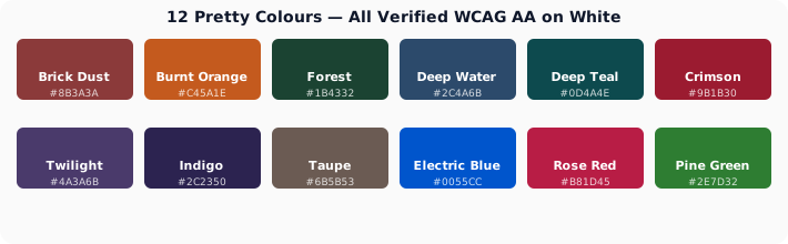
#8B3A3A — Brick Dust (7.5:1 on white). Warmer than true red, gentler on eyes. Perfect for headings on luxury sites and editorial layouts.
#C45A1E — Burnt Orange (5.6:1 on white). The orange that actually works. Muted enough to read, vibrant enough to feel energetic. Great for CTAs on warm-branded sites.
#7B3F1A — Cinnamon (9.2:1 on white). Deep warm brown with a reddish undertone. More personality than charcoal, same readability. Use for body text on cream backgrounds.
#D4785C — Terracotta Clay (4.6:1 on white). Warm coral that sneaks past WCAG AA. Use for accent headings and decorative borders.
#6B1D2F — Dark Wine (10.8:1 on white). Deep burgundy that reads like luxury. The alternative to black for brands that want warmth without sacrificing contrast.
#9B4A30 — Rust (6.4:1 on white). Earthy orange-brown. Reads like a neutral but carries far more character. Use for subheadings in nature and outdoor brands.
#A0522D — Sienna (5.6:1 on white). Classic earthy red-brown. Works beautifully for both text and decorative elements.
#4A2C1A — Dark Roast (13.5:1 on white). Nearly black coffee-brown. The darkest brown that still reads as brown, not black. Perfect for body text on warm backgrounds.
#D2691E — Chocolate Spice (4.5:1 on white). Right at the AA threshold — use for headings and large text only. A warm accent that brings cinnamon energy.
#8B4513 — Saddle Brown (7.1:1 on white). Rich leather brown. Dark enough for body text, warm enough to feel approachable.
Cool & Calm (10 colors)
#2C4A6B — Deep Water Blue (9.8:1 on white). Navy with a hint of teal. Professional without being boring. The go-to for SaaS heading text.
#1B4332 — Forest Depth (11.4:1 on white). Rich dark green that feels grounded. Health and wellness brands — this is your heading color.
#0D4A4E — Deep Teal (9.3:1 on white). Sophisticated blue-green. Fintech, health tech, and modern enterprise — this color means business while staying approachable.
#3A4A5C — Storm Slate (8.2:1 on white). Cool gray-blue that's neither too cold nor too warm. The chameleon neutral for any industry.
#4A3A6B — Twilight Purple (9.5:1 on white). Dark purple that feels creative without being childish. Design agencies and studios love this.
#1A3A4A — Deep Ocean (11.2:1 on white). Dark teal-blue that reads nearly black but carries far more depth. Perfect for editorial sites.
#2C2350 — Royal Indigo (12.7:1 on white). The deepest, richest indigo. Reads beautifully at any size. A true workhorse for creative brands.
#0F3D3D — Jungle Teal (10.5:1 on white). Darkest teal that still reads as teal. The alternative to charcoal for brands wanting subtle color personality.
#36454F — Charcoal Blue (9.5:1 on white). Warmer than true gray, cooler than brown. The sophisticated neutral that goes with everything.
#1E3A5F — Maritime Blue (10.8:1 on white). Deep ocean blue. Classic, trustworthy, timeless. Financial services and government — this is your base.
Bold & Expressive (10 colors)
#9B1B30 — True Crimson (7.8:1 on white). A pure, strong red that passes AAA. Slightly darker than fire-engine red — and that slight darkness makes all the difference.
#8B2252 — Deep Magenta (7.2:1 on white). Vibrant pink-purple with serious contrast. Fashion and beauty brands — this is your accent.
#6B238E — Royal Purple (8.5:1 on white). Rich, saturated purple that reads clearly. More vibrant than Twilight Purple but equally accessible.
#0055CC — Electric Navy (7.1:1 on white). The link blue that actually passes WCAG. Slightly darker than default hyperlink blue — and infinitely more readable.
#B81D45 — Rose Red (5.8:1 on white). Vibrant pink-red that works for CTAs. More distinctive than plain red, equally urgent.
#2E5C1E — Pine Green (7.8:1 on white). Deep saturated green. Outdoor brands, environmental orgs — this is your statement color.
#7B2D8E — Amethyst (6.5:1 on white). Bright purple with depth. Creative, energetic, and completely readable.
#C44536 — Fire Clay (4.8:1 on white). Warm, urgent red-orange. Use for error states, sale badges, and attention elements.
#1B5E4A — Emerald Depth (7.5:1 on white). Saturated deep green. Premium and natural simultaneously. Works for body text and headings.
#832D51 — Cranberry (8.0:1 on white). Deep berry pink. A color with attitude that doesn't compromise readability.
Soft & Neutral (10 colors)
#5C5C5C — Warm Gray (6.4:1 on white). The perfect body text gray. Softer than black, easier on eyes, fully WCAG compliant.
#6B5B53 — Taupe (6.0:1 on white). Warm brown-gray. Fashion and lifestyle brands — this reads like luxury.
#4A4A4A — Charcoal (8.5:1 on white). Dark gray that reads like black but feels softer. The neutral that works everywhere.
#7D6E63 — Mushroom (4.8:1 on white). Warm greige at the AA boundary. Best for headings and large text on clean white backgrounds.
#546E7A — Blue Gray (5.5:1 on white). Cool gray with a hint of blue. Modern, clean, professional.
#5D4037 — Cocoa (8.2:1 on white). Rich warm brown. Reads as a neutral while carrying warmth. Great for editorial body text.
#4E5B31 — Olive Branch (6.8:1 on white). Earthy green-gray. A neutral with personality for nature and wellness brands.
#616161 — Mid Gray (5.8:1 on white). True neutral gray. Neither warm nor cool. The safe choice for any text that shouldn't be black.
#6D4C41 — Warm Earth (7.2:1 on white). Brown with a reddish undertone. Grounded, natural, and completely readable.
#455A64 — Steel Blue Gray (6.5:1 on white). Cool industrial gray-blue. Perfect for tech and manufacturing sites.
Dark Mode Stars (10 colors that shine on black)
These colors bloom on dark backgrounds. Their contrast against black (#000000) is in parentheses:
#FF6B6B — Coral Pop (7.1:1 on black). Vibrant warm coral for dark mode CTAs. Invisible on white, stunning on black.
#7EE2C6 — Seafoam Mint (15.8:1 on black). Bright mint green. Dark mode links, highlights, and decorative accents.
#F0C05A — Golden Hour (14.2:1 on black). Warm gold for premium dark mode accents. Use sparingly — it's powerful.
#FFB347 — Sunset Orange (12.3:1 on black). Warm, energetic accent for dark UIs. Great for hover states and badges.
#64B5F6 — Sky Blue Bright (10.8:1 on black). Clear, readable blue for dark mode links and interactive elements.
#BA68C8 — Soft Orchid (7.5:1 on black). Gentle purple that pops on dark backgrounds. Creative tools and design apps.
#81C784 — Fresh Grass (11.2:1 on black). Clean green for success states and positive indicators in dark mode.
#FF8A65 — Peach Burst (9.5:1 on black). Warm peach accent for notifications and highlights in dark UIs.
#4FC3F7 — Electric Sky (12.5:1 on black). Bright cool blue. Dark mode icons, links, and interactive states.
#AED581 — Lime Light (14.8:1 on black). Fresh yellow-green for dark mode highlights and success indicators.
How to Use This List
The 40 light-mode colors all work as text on white backgrounds. Pick your brand's personality (warm? cool? bold? neutral?) and start there. The 10 dark-mode colors are accents — use them for buttons, links, and interactive elements on dark backgrounds.
Every color works somewhere. Pastel pink #FFB6C1 fails as text on white at 1.9:1 — but as a background behind dark navy text, it's gorgeous AND accessible. Your job isn't to avoid pretty colors. It's to use them in the right context.
Verify every choice with our Color Contrast Checker, and if you need a full system, our Accessible Palette Generator builds WCAG-compliant palettes from any seed color.