
Forms are where accessibility matters most. A login form with insufficient contrast prevents users from signing in. A checkout form with invisible input borders costs you sales. A registration form with unreadable error messages drives users away. Forms aren't just UI — they're conversion points, and inaccessible forms directly impact your bottom line.
This guide covers every color and contrast consideration for accessible form design, from input borders to error states.
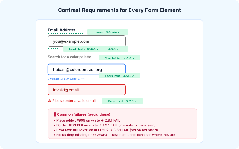
The Four Elements of Accessible Forms
Every form involves at least four visual elements that must meet contrast requirements:
1. Labels — Must have 4.5:1 contrast against the page background (WCAG SC 1.4.3). This applies to both text labels above inputs and labels that appear as placeholders inside inputs.
2. Input Borders — Must have 3:1 contrast against adjacent colors (WCAG SC 1.4.11 Non-text Contrast). This is the most commonly failed requirement — designers love subtle gray borders (#E2E8F0) that blend into white backgrounds at ~1.3:1.
3. Input Text — The text users type into fields must have 4.5:1 against the input background (typically white). #333333 on white is 12.6:1 (passes easily), but lighter placeholder-like text may fail.
4. Placeholder Text — Must have 4.5:1 against the input background. The classic #999999 placeholder on white only achieves ~2.8:1 — far below the requirement. Use #767676 or darker.
Contrast Requirements by Form Element
Using our Form Input Contrast Checker, you can test each of these elements:
Text labels: Need 4.5:1 against the page background. A label color of #333333 on a white page background achieves 12.6:1. Even #767676 (4.5:1) barely passes — err on the darker side.
Input borders (default state): Need 3:1 against the background. #949494 on white passes at exactly 3:1; #767676 gives 4.5:1 and looks more intentional. Avoid #CCCCCC or lighter — these fail.
Input borders (focus state): The focus indicator also needs 3:1. A 2px blue (#3B82F6) outline on white passes at ~4.5:1. Ensure the focus indicator is visible and distinct from the default border.
Placeholder text: Need 4.5:1 against the input background. This means placeholder text on white must be #767676 or darker. The popular #999999 fails at ~2.8:1. Consider whether you even need placeholders — they cause more accessibility problems than they solve.
Error text: Need 4.5:1 against the background. Common error red (#DC2626) passes on white at ~5.2:1. But the same red on a light red background (#FEE2E2) only achieves ~3.6:1 — failing AA. Always test error text against error backgrounds.
Disabled state text: WCAG exempts inactive components from contrast requirements. However, disabled text should still use a color that's clearly distinct from active text — typically via reduced opacity (0.4-0.5) rather than a lighter color.
Practical Recommendations
1. Default to high-contrast borders. A #767676 border on a white input background looks professional and passes the 3:1 requirement with margin. This single change fixes the most common form accessibility failure.
2. Double the border width. A 1px #CCCCCC border is invisible to low-vision users regardless of contrast. Use at least 1.5-2px for input borders. The slightly thicker border also improves the perceived quality of your design.
3. Underline is better than box. Underline-style inputs (like Material Design's early text fields) have less border surface area that needs to meet contrast. A 2px underline in #767676 easily passes 3:1.
4. Always show labels outside inputs. Placeholder-only forms fail multiple WCAG criteria (3.3.2 Labels or Instructions, plus contrast requirements for the placeholder text itself). Labels above inputs provide better usability for everyone.
5. Test with our Form Input Contrast Checker. Input your form's border color, text color, and background color to instantly verify all contrast requirements.
The Business Case for Accessible Forms
Every 1% of form abandonment costs real money. If your monthly form submissions drive $10,000 in revenue and 2% of users abandon because they can't see the input fields, that's $200/month — $2,400/year — lost to inaccessible design. The fixes described in this guide cost minutes to implement and pay dividends indefinitely.
Accessible forms aren't just about compliance — they're about conversion. Clear, high-contrast inputs are easier for everyone to use, regardless of ability. Use our tools to audit your forms today.