
Your brand colors are the cornerstone of your visual identity. They appear on your logo, your website, your products, and every piece of marketing material. But many brand colors — especially bright blues, warm oranges, and soft greens — fail WCAG contrast requirements when used as text or UI elements. The dilemma: change your brand to be accessible, or risk excluding millions of users and potential lawsuits?
The answer is neither. You can maintain your brand identity AND meet accessibility standards. This guide shows you how.
Why Brand Colors Fail Accessibility
Brand colors are chosen for emotional impact, not readability. A vibrant medium-blue (#4A90D9) looks fresh and trustworthy — but against white, its contrast ratio is only ~4.0:1, just below the WCAG AA requirement of 4.5:1. A warm coral (#FF6B6B) is energetic and friendly, but on white it manages only ~3.2:1. These colors work beautifully in logos and hero graphics, but fail as text or interactive elements.
The WCAG doesn't ban these colors. It simply requires sufficient contrast when they carry information. The key insight: your brand color palette for logos and decoration does not need to be the same as your accessible UI palette.
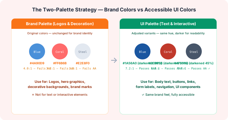
The Two-Palette Strategy
The most effective approach used by companies like Microsoft, IBM, and Google is maintaining two parallel palettes:
1. Brand Palette (for logos, decoration, large graphics): Your original brand colors, unchanged. These are used in contexts where contrast isn't critical: hero backgrounds, decorative elements, brand marks, and large-format graphics.
Check your brand colors inside Figma as you design. No more exporting hex codes to a separate checker.
Install Figma Plugin2. UI Palette (for text, buttons, interactive elements): Slightly adjusted versions of the same colors, optimized for WCAG AA compliance. These preserve the hue and character of your brand colors but with adjusted lightness for readability.
For example, if your brand blue is #4A90D9 (fails AA on white), your UI blue for text might be #1A56A0. It's still recognizably the same blue — just darker and more readable. Users will perceive it as part of your brand family without experiencing accessibility barriers.
Creating Accessible Variants: A Step-by-Step Process
1. Audit your current brand colors using our Brand Color Checker. Input every color in your brand palette and see exactly which combinations pass or fail WCAG AA on common backgrounds.
2. Preserve the hue, adjust the lightness. In HSL color space, keep the Hue (H) value the same, keep Saturation (S) similar, and adjust Lightness (L). For text on white backgrounds, decrease L by 15-30%. For text on dark backgrounds, increase L by a similar amount. Our Contrast Checker helps you find the exact values.
3. Test with your team. Share the accessible variants with designers, developers, and brand stakeholders. The goal isn't to replace the original colors but to supplement them with accessible counterparts for specific use cases.
4. Document the mapping. Create a design token or style guide entry that maps each brand color to its accessible UI variant. For example: 'Brand Blue (#4A90D9) → UI Blue (#1A56A0) for text on white backgrounds.'
Real-World Examples
Microsoft Fluent Design: Microsoft's brand blue is #0078D4 — but their accessible text palette includes darker blues like #106EBE and #005A9E. The logo stays bright; the UI gets the readable variant.
IBM Carbon: IBM's Carbon design system explicitly separates 'interactive' colors (meeting WCAG AA) from 'decorative' colors. The same blue family includes both the bright #0F62FE (for selected states) and the darker #054ADA (for text).
Stripe: Stripe's brand uses a vibrant blue gradient, but their documentation text uses a darker, readable blue. The gradient communicates the brand; the solid darker blue communicates the information.
When to Make Exceptions
Some scenarios don't require WCAG compliance: large brand logos (>3:1 applies for non-text contrast but the text-within-logos exemption may apply), purely decorative elements that convey no information, and incidental text in images that have alternative text descriptions.
However, the safest approach is to make everything pass AA where feasible. It reduces legal risk and improves the experience for everyone — not just users with disabilities.
Your brand doesn't need to be boring to be accessible. With a two-palette strategy, you can maintain a vibrant visual identity while ensuring every user can read your content and use your interface. Start with our Brand Color Checker to audit your current palette.