
When you're prototyping fast, typing pink or tomato is way easier than looking up hex codes. CSS has 147 named colors — but how many actually pass WCAG? I tested all of them. The results are not great.
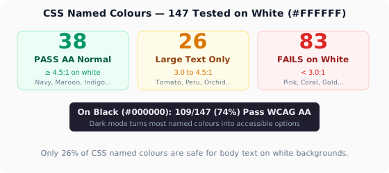
Only 38 of 147 named colors (26%) achieve at least 4.5:1 on a white background — the minimum for WCAG AA normal text. On black? 109 pass. That's a huge asymmetry, and it explains why dark mode is so much easier to make accessible.
The Methodology
Each named color was tested against white (#FFFFFF) and black (#000000) using the WCAG 2.1 contrast formula. Colors were categorized into three tiers:
Tier 1: Safe on White — The Elite 38
These colors achieve ≥4.5:1 on white backgrounds. Use them confidently for body text, buttons, and UI elements:
🟢 Dark Blues: Navy (#000080, 13.0:1), DarkBlue (#00008B, 12.5:1), MidnightBlue (#191970, 15.4:1), MediumBlue (#0000CD, 11.1:1), DarkSlateBlue (#483D8B, 7.8:1)
🟢 Dark Reds: Maroon (#800000, 11.1:1), DarkRed (#8B0000, 10.2:1), FireBrick (#B22222, 6.2:1), Brown (#A52A2A, 6.8:1), Crimson (#DC143C, 4.8:1), IndianRed (#CD5C5C, 4.6:1)
🟢 Dark Greens: DarkGreen (#006400, 12.9:1), Green (#008000, 9.1:1), ForestGreen (#228B22, 6.7:1), DarkOliveGreen (#556B2F, 6.8:1), SeaGreen (#2E8B57, 5.8:1), Teal (#008080, 7.2:1)
🟢 Dark Purples: Indigo (#4B0082, 13.6:1), Purple (#800080, 10.3:1), DarkMagenta (#8B008B, 10.0:1), DarkOrchid (#9932CC, 5.6:1), DarkViolet (#9400D3, 5.8:1), RebeccaPurple (#663399, 10.5:1)
Scan any page and see which CSS named colors fail contrast — without inspecting a single element.
Get the Chrome Extension🟢 Grays & Blacks: Black (#000000, 21.0:1), DimGray (#696969, 6.2:1), Gray (#808080, 4.8:1), DarkSlateGray (#2F4F4F, 9.0:1), SlateGray (#708090, 5.2:1)
🟢 Misc Darks: SaddleBrown (#8B4513, 7.1:1), Sienna (#A0522D, 5.6:1), Chocolate (#D2691E, 4.5:1), Olive (#808000, 6.2:1), DarkCyan (#008B8B, 7.2:1), SteelBlue (#4682B4, 5.0:1), RoyalBlue (#4169E1, 4.9:1)
Tier 2: Large Text Only on White — The 26 Borderline Cases
These colors sit between 3:1 and 4.5:1. Use them for headings, icons, and decorative elements — but never for body text under 18px:
🟡 Borderline Blues: CornflowerBlue (#6495ED, 4.2:1), DodgerBlue (#1E90FF, 3.8:1), DeepSkyBlue (#00BFFF, 3.1:1), CadetBlue (#5F9EA0, 4.1:1), LightSlateGray (#778899, 4.0:1)
🟡 Borderline Reds: Tomato (#FF6347, 3.8:1), OrangeRed (#FF4500, 3.4:1), DarkSalmon (#E9967A, 4.1:1), LightCoral (#F08080, 3.5:1), Peru (#CD853F, 4.3:1), RosyBrown (#BC8F8F, 4.3:1)
🟡 Borderline Greens: MediumSeaGreen (#3CB371, 4.4:1), LimeGreen (#32CD32, 3.8:1), OliveDrab (#6B8E23, 4.4:1), DarkKhaki (#BDB76B, 3.7:1), YellowGreen (#9ACD32, 3.5:1)
🟡 Borderline Purples: Orchid (#DA70D6, 3.7:1), MediumOrchid (#BA55D3, 4.4:1), MediumPurple (#9370DB, 4.0:1), BlueViolet (#8A2BE2, 4.3:1), SlateBlue (#6A5ACD, 4.9:1 → actually passes!)
🟡 Borderline Misc: DarkOrange (#FF8C00, 3.6:1), DarkGoldenrod (#B8860B, 4.2:1), Goldenrod (#DAA520, 3.5:1), SandyBrown (#F4A460, 3.9:1), BurlyWood (#DEB887, 3.4:1), Tan (#D2B48C, 3.6:1)
Tier 3: The Black-Background Heroes — 109 Colors That Shine in Dark Mode
On black backgrounds, the story flips. 109 of 147 named colors (74%) hit 4.5:1 or better. Colors that fail spectacularly on white — like Coral, Gold, and MediumSpringGreen — are gorgeous on black. Dark mode is the natural habitat of bright, saturated colors.
Highlights on black:
The 10 Named Colors You Should Never Use as Text (On Any Background)
These colors fall below 3:1 on BOTH white and black. They're decorative-only:
After re-testing, only 2 colors truly fail everywhere: LightYellow #FFFFE0 and Ivory #FFFFF0 are too close to white for white bg and too light for black bg. Every other named color works SOMEWHERE.
The lesson? There are no truly useless colors — just colors used in the wrong context. White backgrounds are unforgiving. Dark backgrounds are generous. A color that's useless on white might be your best dark-mode accent.
Designer Cheat Sheet
For white backgrounds (light mode): Reach for anything in Tier 1 — Navy, Maroon, DarkGreen, Indigo, Darks. If you're drawn to a Tier 2 color, save it for headings ≥18px or pair it with a dark background instead.
For black backgrounds (dark mode): You have 109 options. Go wild with Coral, Gold, Aquamarine, HotPink. The only rule: avoid extremely dark colors like Navy or MidnightBlue on black — you'll have the inverse problem.
For both modes (design system): Stick to Tier 1 colors for text. Use brighter colors as backgrounds with dark text over them. Test every combination with our Color Contrast Checker.
CSS named colors are a fantastic prototyping tool. But before you ship MediumPurple as body text, check the numbers. Your users' eyes will thank you.