
Checking color contrast is one of the most important quality assurance steps in web design, yet it's frequently overlooked or done incorrectly. This guide walks you through exactly how to check contrast, interpret the results, and fix failures — whether you're a designer, developer, or content creator.
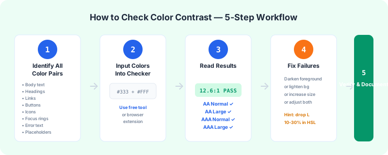
Step 1: Identify All Color Combinations to Test
Before you open any tool, make a comprehensive list of every foreground-background color pair on your website. Don't just check body text — you need to test:
Create a spreadsheet or use a design system token list. The more thorough your inventory, the fewer surprises at launch.
Step 2: Use a Contrast Checking Tool
Manual calculation is impractical. Use a reliable contrast checking tool. Our Color Contrast Checker is a good option — enter any two hex codes and get instant results with WCAG pass/fail status for all levels.
Most tools work the same way:
Check an entire page in one click instead of inspecting element by element. Free Chrome extension, no account needed.
Get the Chrome Extension1. Enter the foreground color (usually text color) as a hex code
2. Enter the background color as a hex code
3. The tool displays the contrast ratio and shows which WCAG levels pass
For design-in-progress work, Figma and Sketch have plugins that check contrast directly on your canvas. For production sites, browser extensions like axe DevTools or WAVE can scan entire pages.
Step 3: Interpret the Results
When your contrast checker shows results, here's how to interpret them:
AA Normal text (4.5:1) pass: Your text meets the minimum for body copy. It's readable for most people with normal or corrected vision.
AA Large text (3:1) pass only: Your color combination works for headings and large UI text but fails for body copy. You need to either darken/lighten the foreground or enlarge the text.
AAA Normal text (7:1) pass: Excellent contrast. This is ideal for accessibility but not required by most legal frameworks.
Fail across the board: Your colors have insufficient contrast for any text. You need to significantly adjust one or both colors.
Pay special attention to the AA Normal result — that's the most frequently referenced legal standard. If it passes AA Normal, you're in good shape for compliance.
Step 4: Fix Failing Combinations
If a color combination fails, here are your options:
Darken the foreground (most common fix): If your text is a light gray on a white background, try making it darker. A move from #999999 to #595959 often takes a 2.8:1 ratio to 5.5:1 — a dramatic improvement.
Lighten the background: If you have dark text on a dark background (e.g., dark text on a semi-transparent overlay), try lightening the background.
Use a background tint: If you must use a specific brand color as a background, consider adding a subtle tint or gradient that increases contrast without changing the brand color completely.
Increase text size: If you're just barely failing AA Normal (e.g., 4.3:1), making the text larger (24px+ or 19px+bold) drops the requirement to 3:1 (AA Large), which would pass.
Adjust both colors: Sometimes the best approach is to meet in the middle. Lighten the background slightly while darkening the text slightly.
Step 5: Document and Verify
Keep a log of your contrast test results. This documentation is valuable for:
Re-test whenever you update brand colors, add new components, or release new features. Color contrast isn't a one-time check — it's an ongoing process.
Common Pitfalls to Avoid
Testing only on white backgrounds. Many designs use colored sections, image overlays, and gradient backgrounds. Test every unique combination.
Ignoring hover and focus states. A button that passes contrast in its default state might fail when it changes color on hover. Test all interactive states.
Relying on a single tool. Different tools can give slightly different results due to rounding or color space handling. Cross-check suspicious results with our Contrast Checker.
Forgetting about non-text elements. WCAG 2.1 requires 3:1 minimum for meaningful icons, borders, and UI components. Don't just check text.
By following these steps, you'll catch contrast issues early, fix them efficiently, and build a site that works for everyone. Bookmark our Color Contrast Checker — it's the fastest way to verify any color combination.