
You found the perfect reference image — a stunning UI mockup, a beautiful photograph, or a competitor's landing page — and you want to use its color scheme in your own design. But are those colors accessible? Will that soft blue pass WCAG AA on white? Will that warm accent color work as a button?
Our Color Palette From Image tool solves this workflow in one step: upload an image, extract its dominant colors, and instantly see which ones pass WCAG contrast standards.
How Color Extraction Works
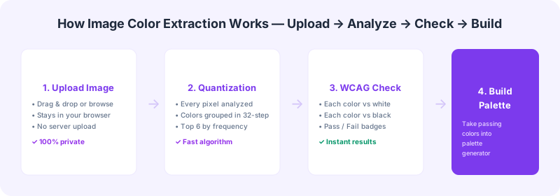
Color extraction (also called color quantization) analyzes every pixel in an image and identifies the most frequently occurring colors. Here's what happens when you upload an image to our tool:
1. Image loading: The image is loaded into your browser using the HTML5 Canvas API. Nothing is uploaded to any server — your image stays on your device.
2. Downsampling: Large images are scaled down to 300px on the longest side for performance, while preserving the color distribution.
3. Color quantization: Each pixel's RGB values are rounded to the nearest 32-step bucket (0, 32, 64, ... 224). This groups similar colors together — #F8F9FA and #F9FAFB both become (248, 248, 248).
4. Frequency counting: The quantized colors are counted, sorted by frequency, and the top 6 are returned as your palette.
5. Accessibility check: Each extracted color is automatically tested against white (#FFFFFF) and black (#000000) backgrounds using the WCAG contrast formula. Pass/fail badges show immediately which colors work as text or UI elements.
When to Use Image Color Extraction
Logo analysis: Extract colors from a client's logo to build their accessible brand palette. Check which logo colors pass WCAG on white and black, then use our Brand Color Checker for a comprehensive audit.
UI inspiration: Found a beautiful dashboard on Dribbble? Extract its palette to understand the color strategy, then verify which colors pass accessibility checks before using them in your own project.
Photography-based palettes: Use a nature or architecture photo as color inspiration. The extraction reveals the underlying palette, and the WCAG check shows you which of those natural colors translate to readable UI text.
Competitor analysis: Extract the palette from a competitor's site to understand their color strategy. Are they using accessible colors? Your analysis might reveal an accessibility advantage you can leverage.
Limitations to Know
Color extraction from an image gives you the palette, but it doesn't tell you how those colors are used. A deep navy extracted from a photo might be the background of a night sky — it would pass WCAG as text, but that doesn't mean it works as a text color in every context.
Also, the extraction algorithm uses frequency-based quantization, which favors large, uniform color areas. Gradients, subtle textures, and anti-aliased edges produce averaged colors that may not match what your eye perceives as the 'main' color. For best results, use images with clear, distinct color regions.
Next Steps After Extraction
Once you have your extracted palette with WCAG pass/fail results:
1. Audit the palette — Use our Brand Color Checker to test every extracted color against all six standard backgrounds.
2. Generate accessible variants — For colors that fail AA, use our Contrast Checker to find slightly darker or lighter alternatives that preserve the original hue.
3. Test with color blindness simulation — Run your palette through the Color Blindness Simulator to ensure it works for users with deuteranopia, protanopia, and tritanopia.
4. Build your palette — Take the passing colors into our Accessible Palette Generator to create a complete, WCAG-compliant design system palette.
Image color extraction is the fastest way to turn visual inspiration into actionable, accessible design decisions. Try it now with our free Color Palette From Image tool.