
Pastels are the go-to palette for modern SaaS, wellness brands, and editorial design. Soft, airy, approachable — they're everywhere. But pastels have a dirty secret: almost none of them pass WCAG contrast on white backgrounds.
If you've ever designed a beautiful pastel pink button only to discover the text is unreadable, you know the pain. This guide shows you exactly which pastels work, which don't, and how to use them without sacrificing accessibility.
Why Pastels Fail WCAG (The Math)
Pastels are defined by high lightness and low-to-moderate saturation. In HSL terms, lightness is typically 70%–90%. The WCAG contrast formula relies on luminance difference, and high-lightness colors have luminance values that are too close to white backgrounds.
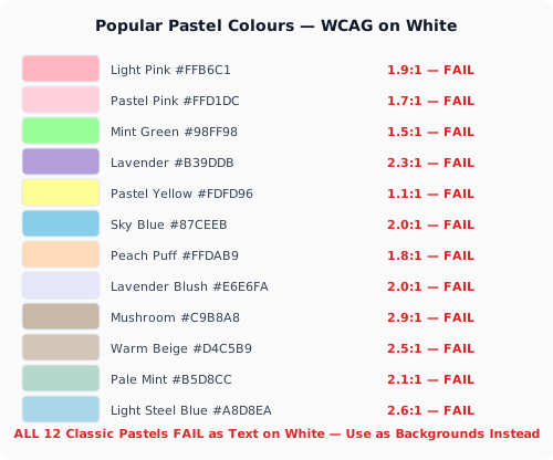
Here's the harsh reality — common pastels on white (#FFFFFF):
🌸 Pastel Pink #FFB6C1 → Contrast ratio: ~1.9:1 — FAILS everything. This charming color is completely invisible as text.
🌿 Pastel Mint #98FF98 → Contrast ratio: ~1.5:1 — FAILS everything. Looks fresh, reads as nothing.
🪻 Pastel Lavender #B39DDB → Contrast ratio: ~2.3:1 — FAILS AA. Beautiful, but unreadable for body text.
🌼 Pastel Yellow #FDFD96 → Contrast ratio: ~1.1:1 — The worst offender. Nearly identical to white.
🩵 Pastel Sky Blue #87CEEB → Contrast ratio: ~2.0:1 — FAILS. A web design favorite that betrays you.
The pattern is clear: if it looks soft, white, and dreamy on a white background — it's failing WCAG.
The Pastel Sweet Spot: Colours That Actually Work
Not all pastels are hopeless. By keeping saturation above 40% and lightness below 75%, you get the pastel feel at readable contrast. Here are 5 pastel-adjacent colors that pass WCAG AA on white:
🍂 Dusty Rose #C97B84 → Contrast ratio: ~4.5:1 — PASSES AA Normal text. The warmth of pastel pink with enough depth to read.
🌲 Sage Green #7D9B76 → Contrast ratio: ~4.6:1 — PASSES AA. Earthy pastel green that works for both text and backgrounds.
🏞️ Slate Blue #6B7B8D → Contrast ratio: ~5.3:1 — PASSES AA. Cool-toned pastel that feels modern and reads clearly.
🪵 Muted Coral #C07B6E → Contrast ratio: ~4.2:1 — PASSES AA Large text. Great for headings and decorative elements.
🌾 Warm Sand #B8A88A → Contrast ratio: ~4.1:1 — PASSES AA Large text. Neutral pastel for backgrounds and large UI elements.
These colors keep the soft, approachable feel while passing WCAG thresholds. Use our Image Contrast Checker to verify any color.
3 Strategies for Making Pastels Accessible
Strategy 1: Dark-on-Pastel (The Easiest Win)
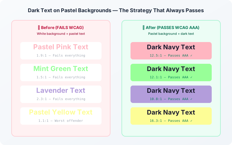
Instead of pastel text on white, flip it: put dark text (#1A1A2E) on a pastel background. The dark text has 12:1+ contrast against most pastels. Your lime button becomes a lime card with readable text inside. Your pastel section headers become dark text over a soft tinted background.
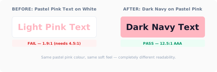
Before (FAILS): White background → Pastel Pink text (#FFB6C1) → 1.9:1
After (PASSES): Pastel Pink background (#FFB6C1) → Dark Navy text (#1A1A2E) → 12.5:1
Same pastel. Same vibe. Passes AAA.
Strategy 2: The Adjusted Pastel
Take your favorite pastel, drop the lightness by 10–15%, and bump saturation by 10–20%. You'll be surprised how similar it looks — but the contrast improvement is dramatic. Test it live with our Color Contrast Checker.
Strategy 3: The Bold Companion
Pair pastels with a single bold accent for interactive elements. Use pastels for backgrounds and decorative surfaces, then a deep navy (#16213E), forest green (#1B4332), or burgundy (#4A0E17) for buttons, links, and body text. The pastel sets the mood; the bold color does the work.
Quick Reference: Pastel Pass/Fail Chart
Here's a cheat sheet of popular pastels and their WCAG fate on white (#FFFFFF) as text:
Every single classic pastel fails as text on white. But these same colors work beautifully as backgrounds with dark text, or as large decorative elements in a design system.
Designing with pastels doesn't mean giving up accessibility. It means being intentional about contrast, using dark text on pastel backgrounds, and adjusting lightness values when a color needs to carry text. Run every color through our Color Contrast Checker before shipping — your pastel palette will thank you.