
Vintage palettes are seductive. The warm, faded tones of a 1970s album cover. The muted, dusty hues of mid-century modern interiors. The sepia-washed nostalgia of old photographs. They feel authentic, handcrafted, real — the opposite of sterile corporate design.
They also almost universally fail WCAG contrast. By design, vintage colours are faded, dusty, and low-saturation — the exact qualities that make them charming are what make them unreadable. This guide shows you how to get the vintage look without the accessibility fail.
Why Vintage Colors Fail (The Nostalgia Tax)
Vintage aesthetics are defined by three visual qualities, all of which work against contrast:
1. Fading. A vintage color looks like it's been sitting in the sun for 30 years. Technically, this means low-to-medium saturation (10%–40% in HSL). Low saturation means the color is closer to gray — and grays struggle for contrast on both white and black backgrounds.
2. Yellowing. Paper yellows. Photographs sepia-shift. Whites become cream, cream becomes beige. The warm tint reduces the luminance gap between foreground and background — the exact mechanism that lowers contrast ratios.
3. Muting. Vintage design avoids anything bright, loud, or saturated. This means text colors hover in the 30%–55% lightness range — exactly where WCAG failures cluster.
A typical vintage text color like #8B7D6B (warm taupe) on #F5F0E8 (aged cream) gives ~3.2:1 — failing WCAG AA. It looks beautiful. It invokes a Craftsman-era workshop. And it's completely unreadable for millions of users.
5 Vintage Palettes That Work (With Adjustments)
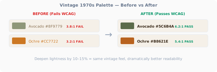
1970s Earth Tones — Fixed
The original aesthetic: Harvest gold, avocado green, warm browns, orange accent.
The problem: Avocado green (#8F9779) gives only 3.8:1 on cream — fails AA for normal text.
The fix: Deepen each color by 10–15% lightness. The palette still reads as 70s, but now it reads, period.
Mid-Century Modern — Fixed
The original aesthetic: Teal, mustard, warm gray, atomic orange.
The problem: Mustard yellow (#D4A017) gives ~4.0:1 on white — borderline, fails for body text.
The fix: Use darker foregrounds on lighter backgrounds. Let the era's colors be backgrounds, not text.
Victorian Era — Fixed
The original aesthetic: Deep burgundy, forest green, gold, dark wood, cream paper.
The problem: Surprisingly, Victorian colors are naturally high-contrast. Deep burgundy, navy, and forest green were achieved with natural dyes and read well. The trap is the gold accents.
The fix: Victorian palettes mostly work. Just avoid gold text — keep gold for decorative borders and accents.
Art Deco — Fixed
The original aesthetic: Black, gold, emerald, deep plum, geometric contrast.
The problem: Art Deco relies on extreme contrast — black, white, and metallics. Gold is the only trap.
The fix: Art Deco is already 90% accessible by nature. The high-contrast geometric style translates perfectly to accessible web design.
1990s Web Nostalgia — Fixed
The original aesthetic: Teal backgrounds, bright blue links, magenta accents, gray text.
The problem: The original 90s web colors were designed for CRT monitors with no accessibility oversight. Gray text on white? #808080 gives only 3.9:1 — fails AA.
The fix: Keep the spirit (teal, bold links, punchy accents) but correct the contrast.
The Golden Rule of Vintage Accessibility
If you remember one thing: vintage colors are backgrounds, not text. Let the era's palette set the mood through surfaces, borders, and decorative elements. Use dark, high-contrast foregrounds for anything that needs to be read. The vintage feel comes from the overall composition — not from forcing users to decode peach-colored text on a beige background.
Test every vintage combination with our Color Contrast Checker. The 1970s didn't have WCAG. Your website does.