
The Accessible Perceptual Contrast Algorithm (APCA) represents the biggest change to digital color contrast standards in two decades. As the proposed contrast method for WCAG 3.0 (codenamed "Silver"), APCA addresses fundamental limitations in the current WCAG 2.x contrast model that have frustrated designers and developers for years.
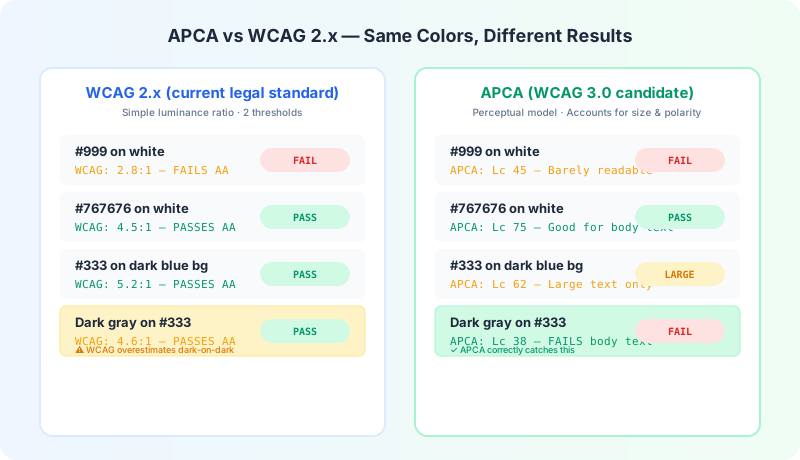
APCA was developed by a team led by Andrew Somers (a veteran accessibility researcher) in collaboration with the W3C. It's not merely an update to the existing formula — it's a fundamentally different approach to measuring readability.
What's Wrong With the Old Formula?
The WCAG 2.x contrast formula has been the standard since 2008, but researchers have identified several problems:
The same ratio looks different at different lightness levels. A 4.5:1 ratio on dark backgrounds reads very differently than 4.5:1 on light backgrounds, even though the metric says they're identical. The WCAG 2.x formula is luminance-based and doesn't account for perceptual differences across the lightness spectrum.
It overestimates contrast for dark colors. Dark colors on dark backgrounds often get higher contrast scores than they deserve perceptually. You've probably seen a design that "passed" contrast checks but still felt hard to read — this is why.
It ignores spatial frequency. The same text at different sizes or font weights should theoretically need different contrast ratios, but WCAG 2.x only has two thresholds (normal and large) with an arbitrary size cutoff.
Thin text is penalized equally with thick text. A light 300-weight font needs more contrast than a bold 700-weight font at the same size, but WCAG 2.x treats them identically.
How APCA Works
APCA addresses these issues by using a perceptually-based model that accounts for several factors:
See how APCA scores compare to WCAG ratios. Input any two colors and compare both standards side by side.
Try the APCA calculatorAPCA Thresholds vs WCAG 2.x Thresholds
While WCAG 3.0 isn't finalized yet, proposed APCA thresholds include:
These aren't one-to-one replacements for WCAG 2.x ratios. A color pair that scores 4.5:1 in the old system might score anywhere from 85 to 105 in APCA depending on the specific colors, font weight, and polarity.
What This Means for Designers Today
Even though WCAG 3.0 with APCA hasn't been formally adopted, smart teams are already preparing:
Don't wait — WCAG 2.x is still the legal standard. APCA is not yet part of any legal framework. ADA, Section 508, the EAA, and AODA all reference WCAG 2.x standards. Continue meeting 2.x AA requirements — APCA readiness is a future-proofing activity, not a replacement.
Start testing with both systems. Use an APCA Calculator alongside the standard WCAG contrast checker to understand how your colors perform in both models. If a pair passes both, it's robust. If it passes WCAG 2.x but fails APCA, it might become problematic in the future.
Prioritize readability over minimum compliance. The best approach is to exceed minimum thresholds in both systems. If you're targeting 7:1 (AAA) in WCAG 2.x, your designs will likely score well in APCA too.
Criticisms and Controversies
APCA hasn't been without controversy in the accessibility community. Some concerns include:
Despite these concerns, the consensus among accessibility experts is that APCA represents a genuine improvement. The W3C continues to refine the algorithm based on community feedback and research data.
Try our APCA Contrast Calculator to see how your colors perform under the next-generation standard, and keep our standard Color Contrast Checker handy for current WCAG 2.x compliance testing.