
You'd expect GitHub, YouTube, X, and the UK Government to get accessibility right. They have the best engineers, the biggest budgets, and dedicated design systems teams. If anyone can ship perfect color contrast, it's them.
They don't.
We ran their homepages through a contrast checker. Every single one had failures. Not edge cases buried three pages deep — failures right on the homepage, on core UI elements that millions of people interact with every day.
Here's exactly where they break, why it keeps happening, and how to catch these failures before they ship.
The 4 Failures We Found (With Screenshots)
1. GitHub — Input Placeholder Text
GitHub's signup page has an input field for your email address. The placeholder text inside that input — "Enter your email" — is a light gray on a white field background.
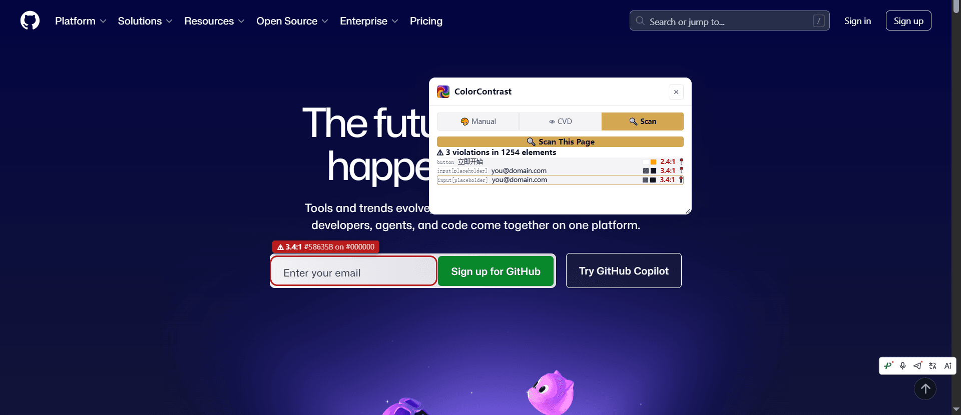
Placeholder text is governed by WCAG Success Criterion 1.4.3 (Contrast Minimum). It needs 4.5:1 like any other text — there's no "placeholder exception." But browsers render placeholder text lighter by default, and most design systems never override it.
The violation: Light gray placeholder (#8B949E) on white (#FFFFFF) gives roughly 3.2:1 — fails WCAG AA for normal text. Anyone typing their email on GitHub in bright sunlight or on a low-quality monitor is squinting at an invisible label.
The fix: Darken placeholder text to at least #767676 (4.6:1) or, better yet, use a visible label outside the input and skip placeholder-only forms entirely. Placeholder-only forms also fail WCAG 3.3.2 (Labels or Instructions).
2. GOV.UK — Search Icon Contrast
GOV.UK is widely considered the gold standard of government web design. Their design system is legendary. But their homepage search box has a magnifying glass icon rendered in a muted gray that blends into the input background.
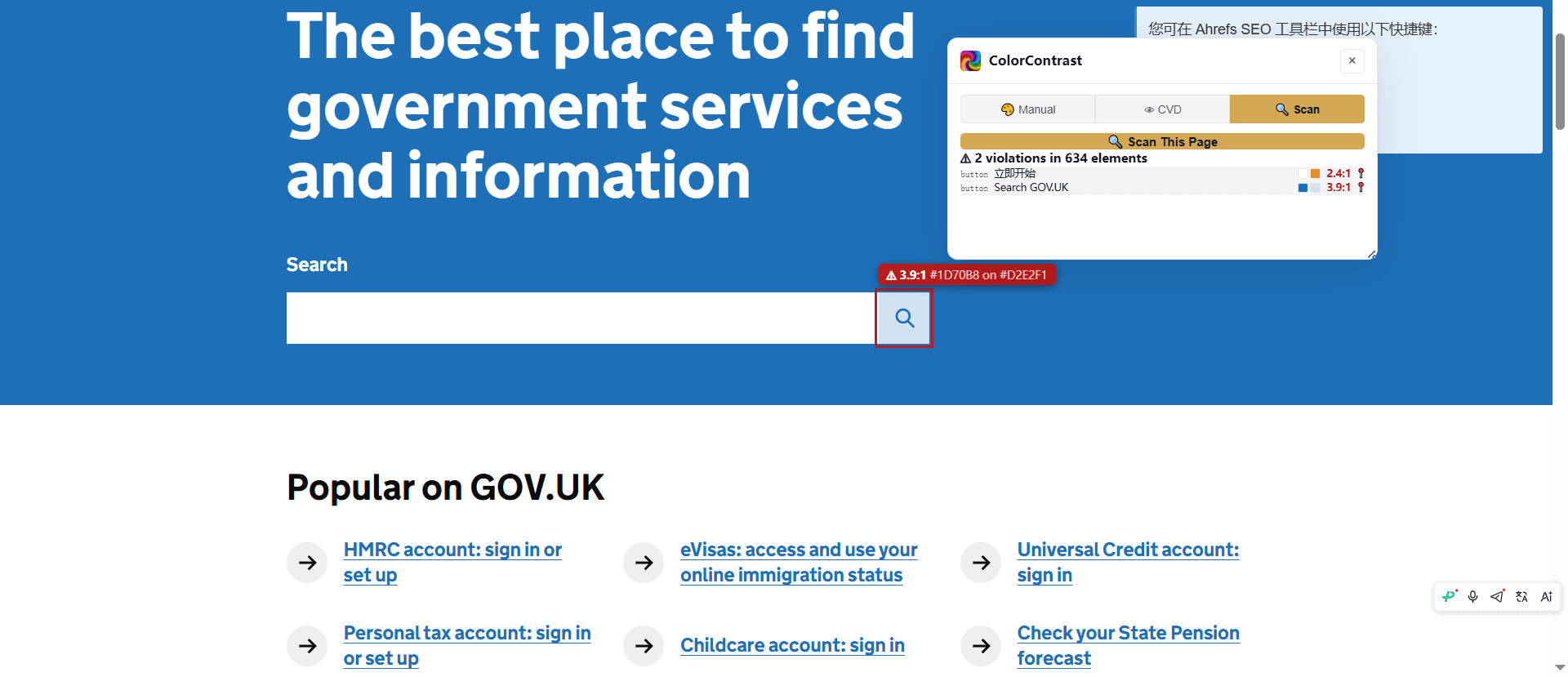
WCAG 2.1 Success Criterion 1.4.11 (Non-text Contrast) requires UI components and graphical objects to have at least 3:1 contrast against adjacent colors. Icons that convey meaning — like a magnifying glass telling you "this is a search field" — are explicitly covered.
The violation: The search icon is a subtle gray that drops below 3:1 against the input background. Users with low vision may not perceive the icon at all, missing the affordance that this input does something specific.
The fix: Increase the icon color to at least #767676 on white, or #949494 on a light gray input background. An icon contrast checker can verify non-text contrast specifically.
3. X (Twitter) — "Load More" Button
X's timeline has a "Show more posts" link at the bottom. It's rendered in a washed-out blue that sits on a near-white background — a classic case of "brand color as UI text."
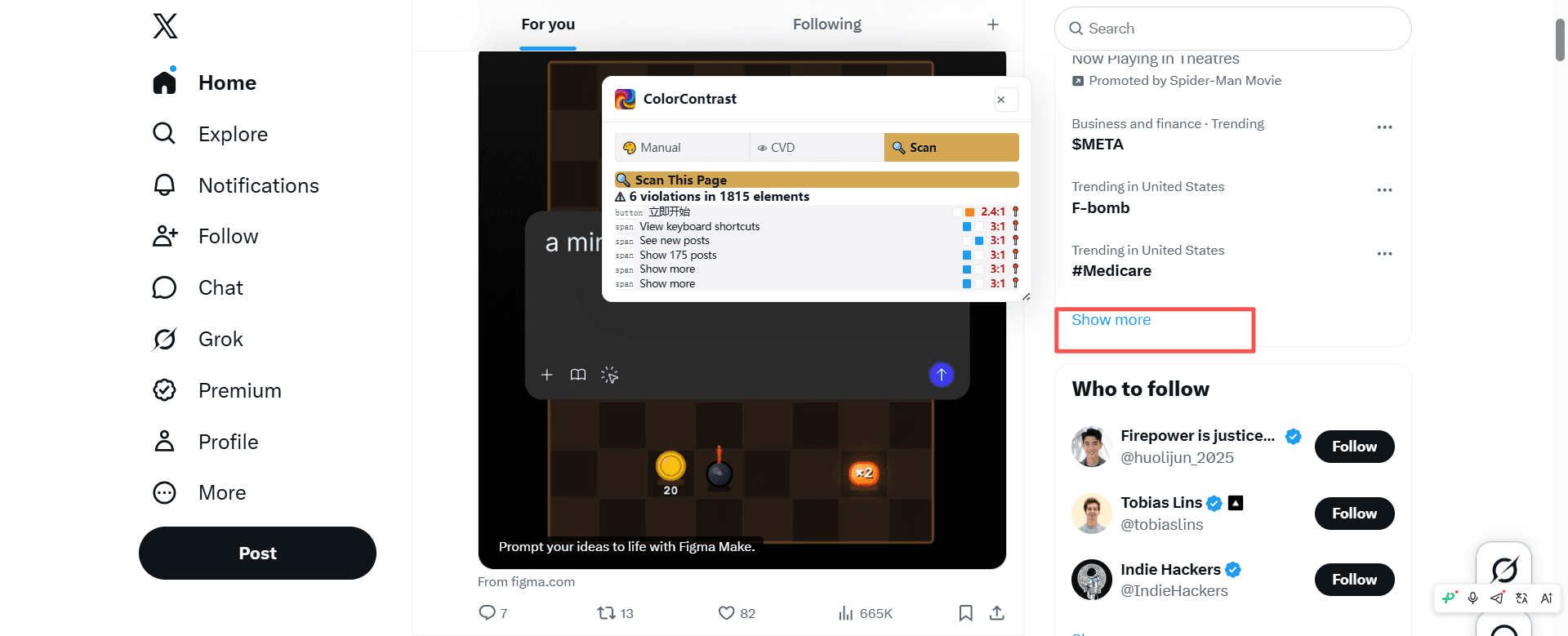
This is the most common contrast failure pattern in SaaS: taking a vibrant brand blue, applying it to text, and not realizing that the same hex code that pops as a 48px logo mark disappears as 14px body text. Spatial frequency matters — smaller text needs higher contrast, but WCAG 2.x doesn't account for font weight differences beyond a binary large/small cutoff.
The violation: X's brand blue on the timeline background falls around 3.5:1 — passes large text but fails WCAG AA Normal (4.5:1). The "Show more" text is small, so it's genuinely hard to read.
The fix: Use a darker variant of the brand blue for interactive text. Instead of the logo's #1D9BF0, use #006BBF or darker for small clickable text. Reserve the bright brand color for large headings and decorative use. A link contrast checker can test link colors against their surrounding text and backgrounds.
Check your own site for contrast violations. Paste any URL and get a full report in seconds.
Scan a page4. YouTube — Footer Text
YouTube's homepage footer contains links like "Terms," "Privacy," and "Policy & Safety" rendered in a faint gray on a slightly-off-white footer background. It's the text they hope you won't read — and the contrast ensures you can't.
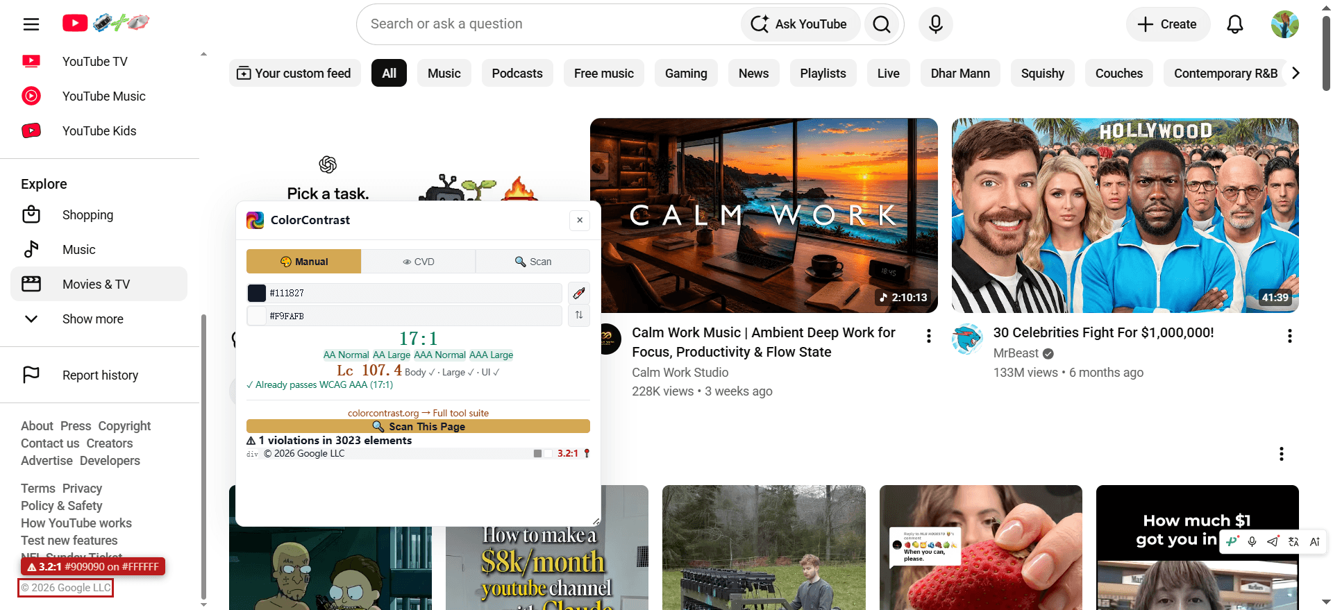
Footer text is the most neglected UI surface on the web. Designers treat it as legally-required fine print and style it accordingly — tiny, gray, invisible. But WCAG doesn't grade on intent. Footer links are navigational content, and they need 4.5:1 just like body text.
The violation: YouTube's footer gray on the footer background measures around 2.8:1 — fails everything. This is functionally invisible to users with low vision.
The fix: Darken footer text to at least #6B6B6B on white, or #595959 on light gray. If you absolutely must keep it muted, make the text larger (24px+) to qualify for the 3:1 large-text threshold. But honestly — if the text is worth putting on the page, it's worth making readable.
5 More Places Contrast Hides (That You're Probably Missing)
The four examples above are from public homepages anyone can inspect. Across many sites, contrast failures tend to cluster in the same predictable places. Here are five more hiding spots worth checking:
5. Cookie Consent Banners
The irony is painful: GDPR forced every site to add a banner, and most of those banners fail accessibility. The "Accept All" / "Reject All" button text is often white on a muted color, and the body text explaining cookie policy is frequently #999 on #F5F5F5 (2.8:1). A legally-mandated UI element that's itself inaccessible.
6. Form Error Messages
Error text is almost always red. But the specific red that designers pick — often #FF4444 or #E53935 — gives only 3.8:1 on white. It's urgent. It's important. And it's unreadable. Use a darker red like #C62828 (5.2:1) or #B71C1C (6.5:1) for error text. The urgency still comes through.
7. Card Meta Text
Blog cards, product cards, user profiles — the metadata (dates, author names, category tags) is nearly always styled lighter than the card title. It's a valid visual hierarchy technique. But when "Jan 15, 2026" is #AAAAAA on #FFFFFF (2.9:1), it's not hierarchy — it's hidden. Keep meta text at #767676 or darker.
8. Disabled Button Text
WCAG has no contrast requirement for disabled elements — they're explicitly exempt from 1.4.3. But that exemption assumes disabled elements are genuinely non-functional. A "Submit" button grayed out because a form is incomplete? That's not decorative — the user needs to know what it says so they understand what action they can't yet take. Our recommendation: keep disabled text at 3:1 minimum even though it's not strictly required.
9. Table Column Headers
Data tables, pricing tables, comparison tables — the column headers are often styled in a lighter weight and lighter color than body text. But they convey structure. A sighted user scanning columns needs those headers. Use at least 4.5:1, and never rely on color alone to differentiate headers from data cells — add bold weight or borders.
Why This Keeps Happening (Even at the Best Companies)
The four sites shown here aren't outliers. Here's why contrast failures survive code review at the world's best engineering organizations:
Design tools lie. Figma renders text differently than browsers. A color that looks crisp on a Retina display at 200% zoom in a design file can disappear on a 1080p monitor at 100% in Chrome. The design tool shows you what you want to see; the browser shows what your users get.
Design tokens drift. A design system defines --text-muted: #6B6B6B. Six months later, a designer eyeballs a new component and types #999999 because it "looks better." The token system only works if every color change goes through contrast verification — and most don't.
Dark mode is an afterthought. A color pair that passes on white may fail on the dark mode background. Most teams test light mode exhaustively and ship dark mode as a CSS variable flip without re-checking every combination.
"It looks fine to me." The designer, the developer, and the reviewer all have normal vision. They all use calibrated monitors in controlled lighting. The contrast failure is invisible to them — so it ships.
How to Catch These Before Your Users Do
Manual inspection misses contrast failures. Automated tooling helps. Here are the main approaches, each with different trade-offs:
1. Browser DevTools (Built-in)
Chrome DevTools displays the contrast ratio in the color picker when inspecting any text element. Firefox's Accessibility Inspector does the same for the selected node. This is the lowest-friction option — the tool is already open while you're debugging CSS.
Limitation: One element at a time. No page-wide scan, no batch testing, no alternative color generation. It tells you the ratio but doesn't propose fixes.
2. axe DevTools (Deque)
The most widely-used automated accessibility testing tool. The free browser extension scans entire pages and identifies contrast violations alongside other WCAG issues — keyboard traps, missing ARIA labels, heading structure problems. The paid version integrates into CI/CD pipelines.
Limitation for contrast work: axe detects violations but doesn't include a color picker, interactive adjustment, or alternative generation. You'll typically use it to find problems, then switch to a dedicated contrast tool to fix them.
3. WAVE (WebAIM)
Free browser extension from WebAIM. WAVE overlays contrast violations directly on the page, with icons and inline annotations that make issues visible to non-technical reviewers during QA. Particularly useful for educational settings and one-off audits.
Limitation: Detection only — no interactive color adjustment, no APCA support, no fix suggestions. WAVE answers "is there a problem?" but not "how do I fix it?"
4. Dedicated Contrast Tools
Several free online tools focus specifically on color contrast rather than general accessibility auditing. These tools let you input two colors (or pick them from a palette), see WCAG AA/AAA results in real time, and often generate alternative colors that preserve hue while meeting a target ratio. Examples include WebAIM's Contrast Checker, Accessible Web's Color Contrast Checker, and colorcontrast.org — a site that also includes a URL scanner for page-wide checks, an APCA calculator for the upcoming WCAG 3.0 standard, and browser/Figma extensions for checking contrast without leaving your workflow.
Limitation: These tools focus on contrast only, not the broader WCAG spectrum (keyboard navigation, screen reader compatibility, document structure). For comprehensive audits, pair a contrast tool with axe DevTools or similar.
5. Design Tool Plugins
Figma, Sketch, and Adobe XD all have contrast-checking plugins that run inside the design tool. This catches contrast failures at the earliest possible stage — before they become code. The Figma ecosystem alone has several options, many free. The key advantage is catching issues during the design review rather than during QA or, worse, after launch.
Limitation: Design-tool rendering differs from browser rendering. Font anti-aliasing, color management, and monitor calibration mean a color that looks fine in Figma may still fail in the browser. Always verify in-browser before shipping.
Start With Your Own Site
If GitHub, YouTube, X, and GOV.UK can ship pages with contrast failures, most sites probably have them too. The fastest check: open your homepage in Chrome DevTools, inspect a few text elements, and look at the contrast ratio in the color picker. Or use a URL-level scanner to get a full-page report in seconds.
Catching failures early — in the design tool, during code review, or with an automated scanner — is always cheaper than fixing them after launch, and always cheaper than an ADA demand letter.