
Designing a color blind friendly palette isn't just about being inclusive — it's about creating interfaces that communicate clearly for everyone. Approximately 300 million people worldwide have some form of color vision deficiency (CVD). In a typical office of 100 people, 4-5 will have difficulty distinguishing certain colors. This guide shows you how to design palettes that work for all of them.
Understanding Types of Color Blindness
Color blindness isn't a single condition. Different types affect people differently:
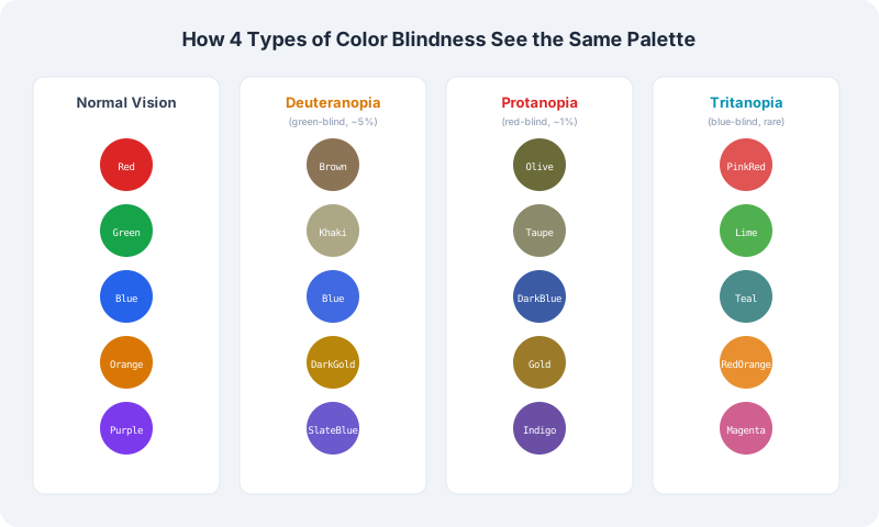
Deuteranomaly (green-weak, ~5% of males): The most common form. Green appears less vivid and can be confused with red. Traffic light reds and greens may look similar.
Protanomaly (red-weak, ~1% of males): Red appears darker and less vivid. Reds can be confused with blacks, dark grays, and some greens. Red-green distinction is impaired.
Protanopia and Deuteranopia (~2.5% of males combined): Complete inability to perceive red or green light. The world appears in shades of blue and yellow. Red and green are indistinguishable.
Tritanomaly/Tritanopia (rare, ~0.01%): Blue-yellow color deficiency. Blues appear greenish, yellows appear pinkish. This is extremely rare and equally affects males and females.
Monochromacy (very rare): Complete color blindness — the world is seen in shades of gray. Affects about 1 in 30,000 people.
The Golden Rules of Accessible Color Palettes
Rule 1: Never Rely on Color Alone
This is the most important rule in accessible design. WCAG Success Criterion 1.4.1 specifically requires that color is not the only visual means of conveying information. If you use red to indicate errors, also include an icon. If you use green for success states, also show a checkmark. If chart segments are color-coded, also use patterns or labels.
Rule 2: Use High Contrast Combinations
Color blind users benefit from the same high-contrast designs that help everyone. Our Color Contrast Checker ensures your text meets WCAG requirements, but for palette-wide design, follow these guidelines:
Rule 3: Add Secondary Cues
Every piece of color-coded information should have a secondary cue:
Build a palette that works for everyone. Generate WCAG-compliant color combinations that are distinguishable by all CVD types.
Build your accessible paletteRecommended Color Blind Safe Palettes
Blue-Orange Palette (Most Reliable)
The blue-orange palette is widely considered the most robust for color blind users because blue and orange are distinguishable by all common types of color blindness (including red-green and blue-yellow deficiencies).
Accessible Brand Palettes
The "Color Brewer" Safe Set
Originally developed for cartography, this set works well for UI data visualization:
#E69F00 (orange), #56B4E9 (sky blue), #009E73 (green), #F0E442 (yellow), #0072B2 (blue), #D55E00 (vermillion), #CC79A7 (pink)
Note that even in a "safe" palette, you should still ensure adequate contrast for text and label against each color.
Testing Your Palette
Never assume your palette works — test it:
1. Use our Color Blindness Simulator to see how your design looks to users with protanopia, deuteranopia, and tritanopia
2. Convert to grayscale — if information disappears in grayscale, you're relying too much on color
3. Get real user feedback — simulation tools approximate CVD but can't replace testing with actual users
4. Check contrast ratios — even color blind safe palettes need adequate contrast for readability
Common Pitfalls and How to Avoid Them
Pitfall: Using green for success and red for errors. This is the most common design pattern and the most inaccessible. Instead, use green + checkmark for success and red + X icon for errors. Or use position: success messages go at the top, errors appear inline next to fields.
Pitfall: Color-coded charts without labels. A pie chart where segments differ only by color is unreadable for color blind users. Always add direct labels, callout lines, or a clearly-differentiated pattern overlay.
Pitfall: Link colors that only differ from body text by hue. Inaccessible: black body text with blue links (both have similar luminance). Accessible: dark gray body text with a distinctly brighter blue link that has an underline.
Pitfall: Soft, low-contrast UI elements. That subtle gray border around a form field may seem "clean" but becomes invisible to users with low vision or contrast sensitivity. Dial it up.
Tools and Resources
Designing for color blindness doesn't mean creating boring, gray interfaces. Some of the most visually striking design systems in the world are also the most accessible — because good accessibility is good design. Use our Color Blindness Simulator to test your designs and our Color Contrast Checker to ensure readability.