
The Web Content Accessibility Guidelines (WCAG) set the global standard for digital accessibility. Version 2.2 is the current recommended standard, and its contrast requirements are the most commonly referenced accessibility metrics in web design today. If you've ever been told your website needs to meet "AA" or "AAA" standards, here's exactly what that means.
WCAG is organized into three conformance levels: A (minimum), AA (standard), and AAA (highest). For most websites and legal compliance, AA is the target. AAA is considered an enhancement that you should strive for where possible but isn't universally required by law.
WCAG AA Contrast Requirements
WCAG AA is the most widely adopted standard and is referenced by legal frameworks including the ADA (Americans with Disabilities Act), Section 508, the European Accessibility Act, and the Accessible Canada Act. If a contract or regulation says "accessible," they almost always mean WCAG AA.
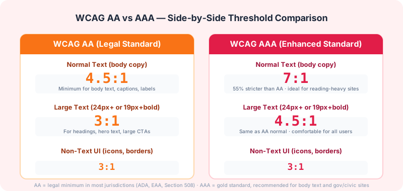
Normal Text: 4.5:1 Minimum
Any text smaller than 18 point (24px) at normal weight, or smaller than 14 point (about 18.66px) at bold weight, must have a contrast ratio of at least 4.5:1 against its background. This covers the vast majority of body copy, captions, labels, navigation links, and small UI text.
Why 4.5:1 specifically? Research conducted by the W3C found that people with 20/40 vision (the threshold for most vision screening referrals) could read text at approximately 4.5:1 without difficulty. People with 20/80 vision (typical for many older adults) could also read it with some magnification. The number represents the minimum needed for a broad, inclusive audience.
Large Text: 3:1 Minimum
Text that is at least 18 point (24px) at normal weight, or at least 14 point (about 18.66px) at bold weight, only needs a 3:1 contrast ratio. The rationale is straightforward: larger text is inherently more legible because of its physical size, so it can tolerate less contrast and still remain readable.
This includes most headings, large call-to-action buttons, hero section text, and banner headlines. Note that if a heading is 24px but also sits on a busy background image or gradient, you might still need higher contrast — the 3:1 rule applies to solid backgrounds only.
Non-Text Contrast: 3:1 Minimum
WCAG 2.1 added Success Criterion 1.4.11, which requires that meaningful user interface components and graphical objects have at least 3:1 contrast against adjacent colors. This covers icons, chart elements, form input borders, focus indicators, and any other visual information required to understand or use the interface.
WCAG AAA Contrast Requirements
AAA represents the highest conformance level. While you should target it when feasible, the W3C acknowledges that AAA compliance isn't possible for all types of content. For example, brand colors or logos may not be changeable, and some decorative elements inherently lack high contrast.
Normal Text: 7:1 Minimum
AAA requires 7:1 for normal-sized text — significantly more demanding than AA's 4.5:1. This ensures readability for people with moderate visual impairments, older users, and those reading on low-contrast displays or in challenging lighting conditions. Text that meets AAA is exceptionally crisp and readable.
Large Text: 4.5:1 Minimum
For large text, AAA requires 4.5:1 — the same ratio that AA requires for normal text. This means AAA large text is as strict as AA normal text.
When Each Level Is Required by Law
The legal landscape varies by country, but the trend is clear: accessibility requirements are becoming law everywhere.
United States: The Department of Justice has consistently interpreted Title III of the ADA to apply to websites. While there's no explicit numeric standard in the law, courts routinely reference WCAG 2.0/2.1 Level AA as the benchmark. Settlements frequently require WCAG 2.1 AA compliance within 6-12 months. A 2024 ruling in California further solidified that WCAG 2.1 AA is the de facto standard for digital accessibility litigation.
European Union: The European Accessibility Act (EAA) requires WCAG 2.1 AA compliance for many digital products and services by June 28, 2026. This is a legislative requirement with enforcement mechanisms, not just a recommendation.
Canada: The Accessible Canada Act (ACA) and provincial legislation like the AODA in Ontario require WCAG 2.0 AA compliance, with deadlines that have been rolling out since 2021.
United Kingdom: Following Brexit, the UK maintains its own accessibility regulations that mirror WCAG 2.1 AA for public sector websites, and the Equality Act 2010 has been interpreted to apply similarly to private sector sites.
Practical Tips for Meeting WCAG Contrast
1. Test early and often — Don't wait until launch. Check contrast during design, development, and QA. Our Contrast Checker makes this easy.
2. Don't rely on visual inspection alone — Colors that look different on your screen may still fail contrast requirements. Always verify with a tool.
3. Design with a larger palette than you need — Start with colors that exceed minimum requirements. When you need lighter tints for hover states or disabled elements, having headroom prevents failures.
4. Document your conformance level — If specific parts of your site don't meet AA, document the exception and why. This protects you in legal contexts and shows good faith effort.
Understanding WCAG contrast requirements isn't just about avoiding legal trouble. It's about building websites that work for everyone — including the 15% of the global population living with some form of disability. Our Color Contrast Checker lets you instantly verify any color combination against all WCAG levels.