
Color contrast ratio is the measure of the difference in luminance between two adjacent colors — typically text and its background. When you read a website, your ability to distinguish words from the background depends entirely on this ratio. The higher the contrast ratio, the easier it is to read.
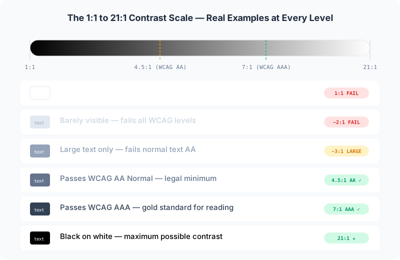
The contrast ratio scale runs from 1:1 (no contrast at all — identical colors) to 21:1 (maximum contrast — black on white or white on black). Every pair of colors falls somewhere on this spectrum, and the number tells you how readable that combination will be for the average person.
How Contrast Ratio Is Calculated
Contrast ratio isn't subjective or based on how a color "feels." It's a mathematical formula defined by the W3C's Web Content Accessibility Guidelines (WCAG). The formula works like this:
First, each color in an sRGB hex code is converted to its relative luminance — a value between 0 (pure black) and 1 (pure white). This conversion accounts for the fact that human eyes perceive different wavelengths of light with different sensitivity. Green appears brighter than blue at the same intensity, for example.
The formula for relative luminance of an sRGB color is: L = 0.2126 × R + 0.7152 × G + 0.0722 × B, where R, G, and B are the linearized color channels. Once you have the luminance of both colors, you calculate the contrast ratio as (L1 + 0.05) / (L2 + 0.05), where L1 is the lighter color and L2 is the darker color.
Real-World Examples
Let's look at some concrete examples so you can build intuition for what different ratios look like:
See how the contrast formula works with real colors. Enter any two colors and get the ratio instantly.
Check your contrast ratio nowWhy Contrast Ratio Matters
Contrast ratio isn't just a technical metric — it has real consequences for real people. About 1 in 12 men and 1 in 200 women have some form of color vision deficiency (color blindness). Additionally, contrast sensitivity declines with age, with many people over 50 requiring significantly higher contrast than younger users.
Low contrast text causes eye strain, headaches, and reading fatigue for everyone — not just people with visual impairments. In bright sunlight or on low-quality displays, even moderate contrast ratios can become unreadable. This is why accessibility standards don't just exist for people with disabilities; they create better experiences for all users.
How to Check Contrast Ratio
You don't need to calculate the luminance formula by hand. Our Color Contrast Checker does all the math instantly. Just enter your foreground and background hex codes, and you'll see the exact ratio along with WCAG pass/fail status for AA Normal, AA Large, AAA Normal, and AAA Large standards. Need to check an entire site at once? Our URL Contrast Checker scans any live page and flags every contrast violation automatically.
Most design tools like Figma, Sketch, and Adobe XD include built-in contrast checkers, but they sometimes use older algorithms. For the most accurate results, always verify against the WCAG formula directly.
Common Misconceptions
"My brand colors look fine to me, so they're accessible." — This is the most common mistake. What looks readable to you on your calibrated monitor in a dim room may be illegible to someone with low vision on a phone screen in direct sunlight. Always test with actual contrast ratios.
"As long as there's some difference, it's fine." — A 2:1 ratio is technically "some difference," but it fails every WCAG threshold. For normal body text, you need at least 4.5:1. For large text (24px+ or 19px+bold), you need at least 3:1.
"Color contrast only matters for text." — Non-text elements like icons, form input borders, and focus indicators also need sufficient contrast. WCAG 2.1 introduced a specific 3:1 requirement for meaningful non-text elements.
Understanding contrast ratio is the first step toward building accessible, user-friendly interfaces. Use our Image Contrast Checker to see the math behind any color pair, or our Color Contrast Checker for a full WCAG compliance test with live previews.